There is a particular kind of silver. Smooth, just slightly warm, reflecting the glow of a far-away planet off a curved metal surface. Set against the backdrop of navy blue with swirls of yellow smoke and lettering reminiscent of a 1950s-era space brochure, the image is complete. It has fins not required by any existing rocket, a nose cone which looks more like a concept than a plan, and an itinerary for MARS, or VENUS, or ORBITAL STATION stenciled in bold letters. It should feel dated. Instead it feels precise. Retro rocket imagery built a visual language so internally consistent that it still reads without context, more than seven decades after its peak.
A Style Born From Imagination, Not Engineering
The retro rocket is a visual style rather than a historically accurate machine. It was used mainly in illustration and print from the 1930s through the 1960s to represent what space travel could look like, but not necessarily how it would work. The designers were designing rockets to visit places that the engineers had not yet built spacecraft to get to. This created a vocabulary of visual elements, such as tall, thin bodies, fins that were larger and more prominent than necessary, and colorful exhaust plumes. These were not mistakes in the drawings. They were compression a way of saying rocket, future, adventure in a single silhouette.
The fins are the most legible element. Real early rockets did use fins for atmospheric stability, but science-fiction illustration pushed them well past any functional requirement. The oversize fin became a visual shorthand readable at distance or at speed, the way a pointed nose communicates direction and a wide exhaust flame communicates energy. Together they collapsed the entire concept of spaceflight into a shape a child could sketch from memory, and that legibility is central to why the aesthetic has held.

"Grand Tour" poster, 2016. NASA Jet Propulsion Laboratory Design Studio, Wikimedia Commons, public domain. Reproduced for commentary and analysis.
This is made clear through the use of one poster by NASA’s JPL Visions of the Future series known as “Grand Tour”. The designers from JPL used the influences of Art Deco from the 1930s, streamlined shapes, transparency layers, compact lettering style to advertise the actual route that Voyager 2 had taken to travel past all four outer planets. The color field sits in deep teal with warm gold type. The composition does not hide its references; it folds them into something that feels neither period reproduction nor strictly contemporary. The poster imagines a future that already happened, rendered in the visual language of a future that was imagined before it did.
Chesley Bonestell and the Idea That Space Had a Surface
Among the artists that defined the visual perception of the appearance of alien worlds by mid-twentieth century audiences, no one did it better than Chesley Bonestell. His images combined astrophysical knowledge with photographic realism of textures, turning the planets into walkable surfaces rather than dots on a diagram. When Life magazine published his 1944 series depicting Saturn as seen from its moon Titan, general audiences encountered for the first time the idea that space had specific visual qualities lit rock faces, textured ground, a planet filling a quarter of the sky.
Between 1952 and 1954, Bonestell worked alongside rocket engineer Wernher von Braun to create illustrations in Collier’s magazine entitled “Man Will Conquer Space Soon.” The pictures were authoritative in their representation and had the quality of an architectural drawing with orbital stations depicted in cross-section, landers positioned in the craters of the Moon, and suited men walking on Mars with intentional body posture. Rocket bodies were white and sleek. Landing legs spread wide on grey dust. The compositions showed not just hardware but inhabited activity spaceflight as a place people would work in, not merely a trajectory to achieve. His 1953 painting The Exploration of Mars, now in the Smithsonian's National Air and Space Museum, places a finned rocket among Martian rock formations with the spatial logic of landscape painting. Its power comes from the angle and the color rather than from the rocket's specifications. Bonestell gave the future a specific time of day, and that concreteness was the point.

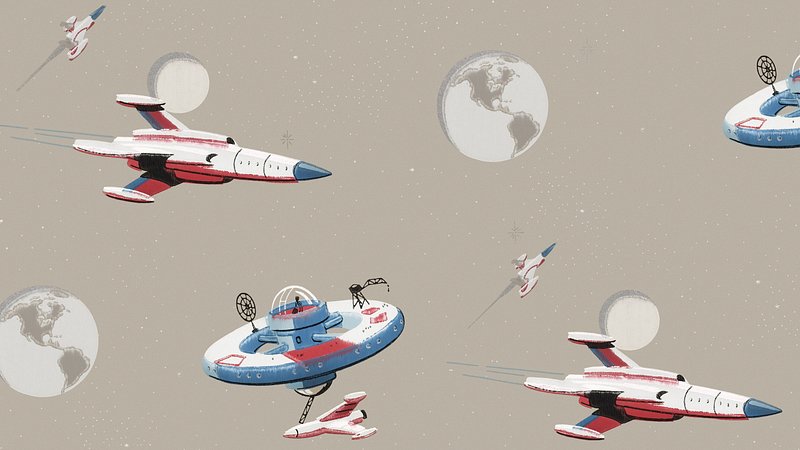
Wallpaper with space stations and rockets, circa 1950. Chromolithograph, original public domain image via Wikimedia Commons / Rawpixel. Reproduced for commentary and analysis.
The chromolithograph below dated approximately 1950 captures the era’s visual language within the same frame. Various rockets and orbiting stations are featured within the illustration, each illustrated in clear line work and bold colors. Nothing in the composition tells a story; it demonstrates a set of shapes and says: this is what the future looks like assembled together. The printing technique matters here. Chromolithography produced bold, consistent color at scale the same quality that gave mid-century poster design its directness and the image reads with exactly that confidence.
Color as System, Typography as Timestamp
The color logic of retro rocket imagery was not decorative. It was functional in a specific way: each zone of a composition carried a coded meaning that worked across the entire genre. Silver and metallic grey signaled advanced engineering materials. Red on fins and nose cones created visual urgency. Orange and yellow at the exhaust located the source of energy and motion. Cream tones aged a composition, replicating the warmed look of printed illustration over photography. Deep blue and black opened the background into space while giving the rocket contrast to read against. Used together across hundreds of different images by different artists, these color relationships became conventions a shared palette that any viewer could read without introduction.
Typography carried a parallel function. Bold condensed sans-serifs, geometric faces, oversized destination numerals, and uppercase stencil lettering communicated historical period even when the spacecraft itself was invented. A destination label in condensed geometric type signals a specific era of imagined futurity regardless of when the image was actually made. This is what the designers of JPL who designed the “Visions of the Future” series in 2016 say about this: For the Grand Tour poster, they used the Art Deco style of the 1930s without copying it precisely, creating a "retro-future vibe". For the Venus poster, a curved font was selected to correspond with the clouds of the planet. Typography was not labelling the image it was setting its emotional register, placing the viewer in a particular version of the future.
The link to larger themes in Atomic Age design was no accident. By the end of the 1940s, radial designs, starbursts, orbital curves, and metal finishes were being applied widely in architecture, product design, and graphic design inspired by the imagery of nuclear physics and aviation. The rocket had absorbed all of this imagery instinctively since it seemed to be the embodiment of all that was visually interesting about the age. A rocket poster lettered like a 1950s technical manual reads as authentic not because the spacecraft is accurately drawn but because the typography and the vehicle occupy the same design moment.

Mars poster, 2016. NASA Jet Propulsion Laboratory Design Studio, Wikimedia Commons, public domain. Reproduced for commentary and analysis.
The JPL Mars poster applies the retro travel-poster format to a destination no human has reached. Warmer ochres and red-orange hues are placed against blue-gray shadows. The explorer is tiny compared to the landscape, creating an illustration of scale as well as a metaphor for the idea behind the journey. The font used becomes bolder, moving away from the decorative Art Deco style of the Grand Tour poster and towards a more aggressive style that evokes 1950s-style adventure travel posters, but this in itself creates a whole different mood for the picture. What ties it all together is the structure inspired by 1930s national park posters: big destination name, reduced setting, human figure for scale.
When Real Rockets Looked Like Science Fiction?
However, the launch vehicles of the Space Age strengthened rather than supplanted the retro look, for what the engineers actually built proved visually stunning on its own merits. For instance, the Saturn V rocket, designed for use in the Apollo program that aimed for the Moon, was 363 feet high with the spacecraft on top of it, weighed approximately 2.8 million kilograms when fully fueled, and was as wide as a two-lane road at the first stage level. Standing at Launch Complex 39A at the Kennedy Space Center with its white body, black lettering, and orange stage detailing under a Florida sky, it looked very much like painted space illustrations, not because those illustrations were accurate but because the engineers had come up with something that the artists had envisioned.
Images of the Saturn V sitting on the launch pad almost seem to function as evidence. Its color contrasts, scale in relation to the launch tower, and its ability to catch light from a darkening sky all of these were visual facts, not design decisions, and they were in keeping with the visual vocabulary that had developed over twenty years of printed imagery prior to the launch of the rocket.

Saturn V on Launch Complex 39A, Kennedy Space Center, circa 1969. NASA, public domain / Wikimedia Commons. Reproduced for commentary and analysis.
The image reveals the Saturn V as a designed object and not merely as a technological one. The white body with black stencilled lettering, the orange staging bands, the gantry arm at left providing scale together these produce an image that sits between documentary record and compositional study. The vehicle's color logic is almost identical to what mid-century space illustration had established: pale primary form against a darkening sky, with a single strong accent color at the joints between stages.

Enceladus poster, 2016. NASA Jet Propulsion Laboratory Design Studio, Wikimedia Commons, public domain. Reproduced for commentary and analysis.
The Enceladus poster extends the JPL series into cold blue-green territory a color range that no mid-century illustrator reached when imagining Saturn's moons, because the science was not yet there. The compositional structure is unchanged: bold destination name at the top, atmospheric landscape below, a figure for scale. The visual system is fully inherited from the 1950s even as the subject matter is current. That flexibility the ability to absorb new scientific destinations without changing the underlying grammar is part of what makes this design tradition durable.
What the Visual Language Was Actually Claiming?
Retro rocket imagery made a specific argument. Illustration from mid-century America depicted technology in its most positive light: as an easy way to improve one’s lot in life, rather than as another challenge to be faced. Illustration from the 1950s depicting a family embarking on a spacecraft as casually as one would board a train. The future in that picture was not uncertain. It was scheduled. That confidence belonged to its historical moment, the post-war decade when jet travel, television, and synthetic materials were visibly accelerating daily life. And then there was the rocket.
The retro rocket poses a query that contemporary aerospace engineering does not answer: What would it be like to travel to another planet? That is a different question from how efficiently a payload reaches orbit, and it produces different visual answers. A particular shade of silver. A pair of fins the aerodynamicists would have cut. A destination printed in bold condensed caps against a deep blue field. The style was never trying to describe what rockets are. It was describing what they meant.
The Grammar Holds
Retro rocket imagery persists because it solved a visual problem completely. The silhouette communicates vehicle type. The color zones communicate material and energy source. The typography communicates era and aspiration. Each element is readable in isolation and reinforces the others in combination, which is why the style works at postage-stamp scale and at poster scale equally well. The fins are still too large. The exhaust still burns brighter than the physics warrants. Neither detail undermines the image both sharpen it, because legibility was always the point, not accuracy. The retro rocket does not ask to be believed. It asks to be read.