Sputnik’s launch in October 1957 by the Soviet Union organized the visual imagination of a whole era. After some years, the furniture did not resemble what one could recognize as furniture. The buildings were unwilling to rest flat on the ground. The commercial strips of America’s highways were full of starbursts, parabolas, and roof lines that defied gravity deliberately. Space Age Modernism was a distinct visual system, made of distinct materials, distinct forms, and a distinct color scheme.
The Material Palette: Why It Looked Like That
The experimentation with materials was primarily the basis of Space Age Modernism. The design of this style was characterized by recent manufacturing possibilities of fiberglass-reinforced polyester, ABS plastic, injection-moulded polyurethane foam, high-gloss acrylic paints, Mylar, and polished chrome.
Fiberglass made it possible to pour the material into a mold and remove a continuous shell from the mold without any joins or seams. The lack of joints was the point. A chair made of fiberglass molding did not have legs that could be counted, nor a back that could be recognized. Its form was its only statement. Chrome reinforced this from a different direction: polished metal gave surfaces a constant reference to machinery, aerospace equipment, and scientific instrumentation. A chrome pedestal base under a coloured plastic shell was not arbitrary. The combination coded the object as technical, belonging to a world of advanced manufacture.
The colour logic followed directly. White dominated, specifically the white of clean-room conditions and space capsule interiors. Against this base, designers introduced single, highly saturated accents: electric orange, vibrant yellow, turquoise, acid green. Not as decoration distributed across a surface, but as the full identity of one moulded object placed in a white field. The object became a chromatic event. The room existed to frame it.
The Ball Chair: Fibreglass as Architecture at Furniture Scale

Caption: 1963–65 / Eero Aarnio, Ball Chair (Globe Chair) / Collection of the National Gallery of Victoria, Melbourne; photograph by Sailko, Wikimedia Commons / Reproduced for commentary and analysis.
January 11, 1963 was the day when Finnish designer Eero Aarnio made his first drawing of the Ball Chair. The aperture of the sphere was defined through the measurement of the head's arc against the workshop wall, an exact ergonomic calculation behind the guise of a purely formal one. The finished chair mounted a fibreglass sphere on a single chrome pedestal, its interior upholstered to dampen sound and create what Aarnio called "a room within a room."
The first prototype came out of its mould looking, in Aarnio's words, like a deformed potato. The fix was a metal ring inserted around the aperture to stabilize the structure, invisible in the finished piece. Later production versions incorporated stereo speakers and telephone handsets into the interior wall without changing the exterior profile — infrastructure folded inward, surface kept clean. The chair debuted at the Cologne Furniture Fair in 1966 and sold across more than 30 countries in a single week.
The Panton Chair: A Single Form, No Legs

Caption: c. 1967 / Verner Panton, Panton Chair / Photograph: Wikimedia Commons (CC0 Public Domain) / Reproduced for commentary and analysis.
This was a chair made from plastic in one piece and in the shape of an "S" designed by Verner Panton that went into mass production in 1967 by Vitra. It took advantage of the material characteristics that it was made out of. This chair does not have legs, any kind of joinery is invisible, and no part of it is in a different shape.
Panton specified a saturated red for early production runs. Against a white wall, a line of Panton Chairs reads almost typographically, a sequence of identical chromatic units flush with the floor, no base interrupting the visual run. That connection between the moulded furniture as the graphic component of the space was one of the most distinctive features of that era. Panton used cold-pressed polyester with fibreglass reinforcement and then switched to thermoplastic polystyrene. The material changed but not the shape.
The TWA Flight Center: The Same Language at Building Scale

Caption: January 2015 / Eero Saarinen and Associates, TWA Flight Center, John F. Kennedy International Airport, Queens, New York, completed 1962 / Photograph: Acroterion, Wikimedia Commons (CC BY-SA 4.0) / Reproduced for commentary and analysis.
The same formal arguments made at furniture scale — continuous surface, no right angles, structure as motion — played out in Eero Saarinen's TWA Flight Center at Idlewild Airport, completed in 1962. Its roof is a thin-shell concrete structure shaped into four intersecting vaults on Y-shaped piers, producing an exterior that reads as wings mid-flight. No flat surface, no rectangular grid.
Within, the central space moves from check-in through sculptured concrete conduits to the tubular, red-carpeted departure passageways. Warren Platner designed the interiors, taking Saarinen’s flowing language of forms all the way down to the furnishings. From the split-flap departure boards, to the carpeted lounges, to the circular windows set into concrete arcs – the idea stayed the same throughout. The building has been placed on the National Register of Historic Places, and was made into the TWA Hotel in 2019. Saarinen died in 1961, one year before it opened.
Googie Architecture: The Space Age on the Commercial Strip

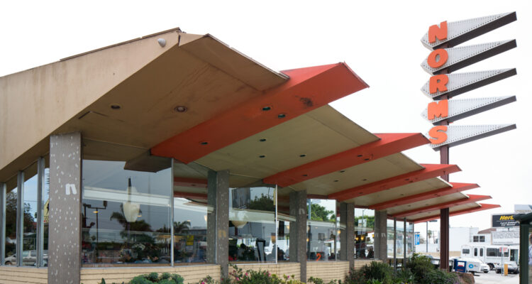
Caption: 2022 / Armet & Davis (interiors by Helen Liu Fong), Norms Restaurant, La Cienega Boulevard, Los Angeles, 1957 / Photograph: Wikimedia Commons / laconservancy.org. Reproduced for commentary and analysis.
Away from design museums and airport terminals, Space Age formal logic was running at full volume along Southern California's roadside commercial strip. Googie architecture translated the same fascination with starbursts, upswept rooflines, and parabolic geometry into buildings whose entire purpose was to catch the eye of a driver moving at highway speed.
Editor Douglas Haskell named the style in a 1952 House and Home article after encountering John Lautner's Googies Coffee Shop on Sunset Boulevard. His three compositional requirements for the style: the building must appear to hang from the sky, it must contain more than one structural system, and it must read as in motion. These were structural claims, not decorative preferences.
Armet & Davis became the most prominent proponents of this style. Interior designer Helen Liu Fong, who became part of the group in 1951, used color for walls that could be viewed while in transit and rooflines that could be seen at high speeds, as well as neon sign writing designed with the viewer in mind. An example of this grammar is found in the Norms Restaurant on La Cienega, which was built in 1957, since it displays all three qualities – an extending canopy, large windows and a sharp roofline.
The Futuro House: Space Age Logic Applied to Habitation

Caption: 1968 / Matti Suuronen, Futuro House (Serial No. 001, restored 2014), EMMA – Espoo Museum of Modern Art, Finland / Photograph: Wikimedia Commons (CC BY-SA 3.0) / Reproduced for commentary and analysis.
Finnish architect Matti Suuronen's Futuro, developed in 1968 as a prefabricated ski cabin for a remote mountain plot, took the movement's formal ambitions to their logical limit. The structure was a fibreglass-reinforced polyester shell, 8 meters in diameter and 4 meters high, assembled from 16 bolted segments on a steel frame. The entrance was an aircraft-style hydraulic hatch. No conventional roof, no eaves, no pitched gable. Windows were circular and evenly distributed around the perimeter.
Interior fitments would be moulded in accordance with the curves of the shell, thus creating an integrated wall, seating, and bed surface. In structural terms, the Futuro realized the concept of the Ball Chair on a much larger architectural level by means of a single form that created architecture through its very shape.
Less than 100 units were manufactured. The oil crisis back in 1973 rendered the production of polyester sculptures impractical. Only 60 remain; Number 001 has been restored and is now housed in the Espoo Museum of Modern Art.
Why It Stopped, and What Kept Going?
By the 1970s, the visual language of Space Age Modernism became much more limited. The energy crisis made plastics unpopular for building; the environmental movement had turned plastics from the sign of progress to a problem. The “future” of 1965 became “disposable” by 1975. The vocabulary of design was much more earthy, with the use of such colors as brown, beige, olive green, and natural wood, and there were no more metallic bases to be found in the shops.
The formal questions haven't gone away. What shape a chair should take when it no longer has to look like a chair, how colour and surface finish contribute to spatial experience, whether a building's structure can read as motion rather than load — these remain active problems. Rounded furniture has returned across interior design in the 2020s; thin-shell concrete structures remain a benchmark of architectural ambition; moulded-form seating is in every airport and office globally. Space Age Modernism made one lasting argument: design can build a version of the future now, from whatever materials are currently at hand.