The cover arrived before the story did. Seven inches wide, ten inches high, printed on coated paper unlike anything like the rough pulp underneath, it portrayed an image designed to have a maximum effect: a figure recoiling from a metal ball, a tentacle creature rising up against a purple sky, and a human figure against a strange machine. At a newsstand in the 1930s, readers made their decisions within seconds. The story was something you found later. What sold the magazine was the image on the front.
That logic, cover art as the primary commercial and visual argument for a publication, shaped everything about how pulp science fiction looked over its three-decade run. The visual system it produced, its color choices, compositional conventions, typography, and paper treatment, defined the genre's surface identity as much as the stories inside.
Two Grades of Paper, Two Different Jobs
The decision by Frank Munsey to change the paper for his magazine, Argosy, into pulp paper in 1896 was meant to save money rather than set the trend. This cheaper wood-pulp paper was coarse, cream-colored, and had untrimmed margins, keeping the price of the 128-page monthly magazine at ten or fifteen cents. After six years, Argosy was having more than 500,000 subscribers.
The cover was printed on something entirely different. Coated stock held rich color ink without bleeding into the fibers, giving the front page a visual density the interior pages could never match. That split between glossy cover and rough interior was a design decision, not a compromise. The cover drew the eye from a distance; the interior delivered the text.
Street & Smith's The Popular Magazine introduced color covers in 1903. By the time Hugo Gernsback launched Amazing Stories in 1926 as the first dedicated science fiction magazine, the visual contract was already established: a fully painted image on coated stock up front, dense columns of text on cream pulp inside.

Amazing Stories, Vol. 1, No. 1, April 1926. Cover by Frank R. Paul. Experimenter Publishing Co. Source: Galactic Central via PICRYL / Internet Archive. Reproduced for commentary and analysis, amazon.com.
Frank R. Paul and the Grammar of the Science Fiction Cover
It was through the Amazing Stories series that Frank R. Paul created the iconic visuals associated with the genre: the alien vistas painted in violet and orange, people reduced to insignificance by machinery, metal surfaces accurately drawn, contrasting against the backdrop of strange coloration.
This can be clearly demonstrated with his cover design for "The Airlords of Han" which was a story of Buck Rogers written by Philip Francis Nowlan in March 1929. The painting features the color purple as the primary one with the usage of yellow and red colors which have been strategically placed in order to catch the viewer's eye. It shows an individual jumping away from a metallic sphere that is approaching him rapidly. The painting does not show one moment of time but several actions happening at once within one picture – past, present, and future.
The interior work by Paul adapted to the restrictions of the paper; thick outlines, large-scale crosshatching, contrasting blocks of light and dark. Fine lines dissolved into the absorbent pulp fibers. What looked crude in reproduction read clearly in the actual format.

Amazing Stories, Vol. 3, No. 12, March 1929. Cover by Frank R. Paul illustrating "The Airlords of Han." Source: Galactic Central via PICRYL / Internet Archive. Reproduced for commentary and analysis. wikimedia.org.
The Cover Was Not the Illustration
A persistent assumption about pulp magazines is that the cover depicted the story inside. Many did not. Editors regularly commissioned covers first and then assigned writers stories to match. Pulp editor Harold Hersey described the process plainly: paint a scene from the lead story, or produce a general image that typifies what the magazine contains.
A cover designed to evoke a genre, rather than illustrate a specific text, reaches for something more immediate: scale, drama, threat, technological strangeness. The reader did not need to know who Anthony Rogers was to understand what kind of world the Amazing Stories cover placed him in.
Reader letters from the era confirm how carefully the covers were received. The writer of a letter in The All-Story Weekly in 1917 felt that artists should be prominently credited along with the authors; he had purchased the magazine only because the cover held his attention on the newsstand. H.P. Lovecraft in a letter to Weird Tales in 1924 praised William Heitman's illustration of "Dagon" not because of its accuracy in describing his story but because of its ambience.

Weird Tales, Vol. 1, No. 3, May 1923. Cover by William F. Heitman. Internet Archive / Pulp Magazine Archive. Reproduced for commentary and analysis. Tellers of Weird Tales.
Color as Commercial Signal
The pulp editors thought that certain colors would blend well with certain audiences, where red and yellow colors were better for men and blue and green colors for women. This was a simplistic formula, yet it indicated something tangible. Color on a pulp cover was not primarily an aesthetic decision; it was a positioning tool.
The purple that dominates Paul's Amazing Stories covers throughout the late 1920s stood out against the warm off-white and orange-yellow tones of general-interest magazines on the same newsstand. The saturated warm accents, red, yellow, orange, read as urgent against the cooler field. The visual pull was immediate, before the viewer processed what the image contained.
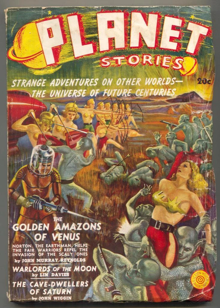
Planet Stories, launched by Fiction House in November 1939, pushed contrast further. Its covers favored deeper reds, more aggressive primaries, figures and spacecraft simplified into bold shapes against alien skies. The palette announced content at a distance: this magazine had no interest in restraint.

Planet Stories, Vol. 1, No. 1, November 1939. Fiction House. Internet Archive / Pulp Magazine Archive. ebay.com. Reproduced for commentary and analysis.
The Figure at Peak Tension
The human body in a pulp science fiction cover occupied a specific compositional slot: arms raised or extended, torso twisted or braced, face locked at the moment before or during impact. The pose communicated genre and mood before the surrounding detail filled in the context.
Margaret Brundage, painting covers for Weird Tales throughout the 1930s, worked in pastels rather than oils, producing a softer tonal range than most contemporaries. Her covers have a different surface quality: less mechanical contrast, more tonal gradation through flesh and fabric. However, the principle of composition is identical – an illustration of a person captured in a moment of dramatic tension surrounded by details that define the genre.

Weird Tales, May 1934. Cover by Margaret Brundage, "Queen of the Black Coast." Source: PICRYL / Internet Archive. commons.wikimedia.org. Reproduced for commentary and analysis.
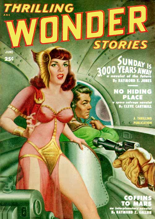
Bergey's covers for Thrilling Wonder Stories and Startling Stories from the 1940s took a very different path in terms of color and design – darker color, explicit silhouette, chrome robots and rocket ships at extreme angles set against highly saturated backgrounds. At newsstand distance the image read instantly; all visual information was front-loaded.

Astounding Science Fiction, cover collection 1940–1949. Internet Archive. americanartarchives.com. Reproduced for commentary and analysis.
Virgil Finlay and Interior Work Against the Paper
Virgil Finlay developed a solution to the pulp paper problem that went against the default approach. Where most artists kept white paper as background with black lines drawn over it, Finlay sometimes reversed the relationship: white lines drawn against large dark fields, stippling that built tonal range through accumulated marks rather than continuous line. The interior art for Weird Tales, Amazing Stories, and Planet Stories possesses a visual weight unusual for the format and can be seen easily on coarse paper stock where more delicate work would have been completed.
The interior art of Edd Cartier in Unknown and Astounding Science Fiction magazine during the late 1930s and 1940s when John W. Campbell was the editor was different. The art was economical with lines that were expressive, not descriptive, and characters whose pose illustrated the action rather than illustration.
The interior illustration in pulp science fiction has been consistently underread as a visual form. The covers attract attention; the interior pages rarely do. But interiors built readers' understanding of settings, scale, and character across a story's length. The cover set the atmosphere. The interiors sustained it.

Astounding Stories, September 1938. Internet Archive / Pulp Magazine Archive. boards.cgccomics.com. Reproduced for commentary and analysis.
Typography That Framed Rather Than Competed
The title design of pulp magazines was created for readability from afar and not for typography. Bold serifs, compressed display fonts, high vertical contrast, in flat color with either inline or shadow effects to give the letters form above the painted artwork below.
Amazing Stories used a bold, compressed serif that read clearly across a newsstand. Weird Tales used a Gothic letterform that signaled supernatural content before the cover image registered. The masthead of Astounding Stories of Super-Science, set in wide capitals, carried its own genre claim without the image having to do that work.
What those cover designs managed well was the relationship between type and image. The masthead occupied the top band and stayed there. Story titles were placed in available space without obscuring key compositional elements. Pricing and issue information retreated to corners. The painted image remained the primary visual event. Typography framed it without competing.
What the Format Left Behind?
Paper shortages during World War II pushed production costs upward. After the war, a more affluent American market found the price gap between pulps and slick magazines less significant. Competition from digest magazines, comic books, and paperback novels fragmented the audience that had once sustained over 150 distinct pulp titles simultaneously.
Science Fiction Quarterly, the last science fiction pulp to maintain the original format, ceased publication in 1958. The visual logic of the pulp cover did not fold with the magazines, however. Paperback cover art absorbed the palette, figure conventions, and compositional staging of pulp illustration directly. Science fiction as a visual genre had been given its surface identity across three decades of monthly covers, and that identity persisted long after the format disappeared.
Still Edition's archive print collection includes cover art from this period as images worth sustained attention, separate from the commercial purposes they were designed to serve. These covers were rushed out on deadline, by artists capable of cranking out as many as seven a week. It is the precision of the visual thought process behind the covers that counts: colors that declared their genre from afar; figures whose composition conveyed their actions faster than you could read them; and the controlled interaction between paint and typeface that ensured legibility as an overall unit.