The chrome catches your eye first. Then the fins, swept back at the angle a rocket should cut through atmosphere, even if the object is a coffee shop in Burbank. There is a starburst somewhere, and the lettering runs bold and angular, every word leaning forward as if gravity is pushing things toward launch. This is Raygun Gothic — a visual system assembled between roughly 1930 and 1970 from pulp magazine covers, neon-soaked diners, comic-book palette, and a cultural mood that treated outer space like a neighborhood you would eventually move to.
The term itself arrived late. William Gibson gave the name to this architectural style in 1981 in his short story "The Gernsback Continuum." In that story, one of the characters referred to some of the 1930s buildings as "Raygun Gothic," which is a futuristic style of architecture inspired by the visions of the future from the 1940s and 1950s. By 1981, the style had already faded. The name arrived after the funeral.
The Cover That Built a Visual Language
The most evident point to begin with is Amazing Stories, which was invented by the publisher Hugo Gernsback in April 1926. The Amazing Stories magazine was the first of its kind, which focused on science fiction. For the cover of the magazine, Gernsback employed Frank R. Paul, who was an Austrian illustrator and was an architect by profession. Paul did this for every issue through June 1929, establishing how "the future" would look before most of his readers owned a telephone.

Amazing Stories, Vol. 1, No. 1, April 1926. Cover and masthead by Frank R. Paul. Publisher: Hugo Gernsback / Experimenter Publishing, New York. Public domain. Source: Picryl / Galactic Central. Reproduced for commentary and analysis.
What Paul delivered on that first cover set a template that dozens of illustrators would follow for four decades. A figure — suited, helmeted, purposeful — locks against a planetary surface or starfield. Machinery occupies the mid-ground at a scale that dwarfs the human body. The horizon is usually impossible: a city of towers or a ringed planet overhead. Scale relationships between foreground and background follow no physical logic; they exist entirely to communicate magnitude at a glance.
The colors were partly forced by the economics of cheap three-color pulp printing, which made saturated reds and yellows the practical default. Paul turned that constraint into a style. Vivid backgrounds competed with the illustration itself; foreground figures in contrasting hues separated sharply from whatever city or sky sat behind them. A cover had to read from across a newsstand in under a second. That requirement shaped every compositional decision Paul made, and it shaped everything that came after him.

Amazing Stories, Vol. 2, No. 5, August 1927. Cover by Frank R. Paul, illustrating H. G. Wells' "The War of the Worlds." Publisher: Hugo Gernsback / Experimenter Publishing. Public domain. Source: Picryl / Galactic Central. Reproduced for commentary and analysis.
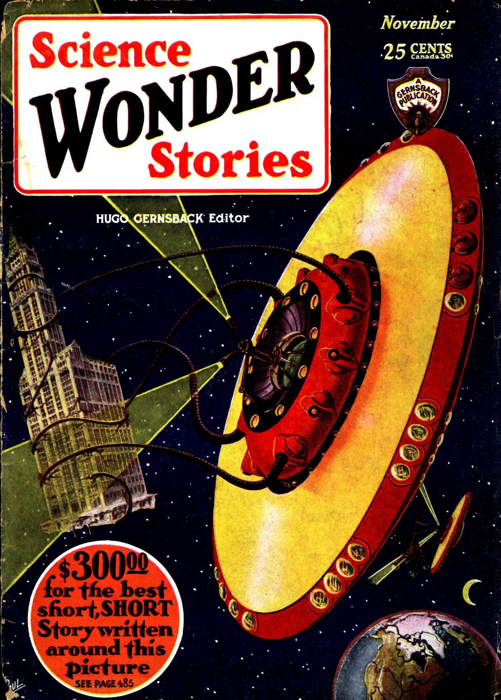
Between 1926 and 1929, Paul illustrated 38 covers of Amazing Stories before accompanying Gernsback to his next magazine, Wonder Stories, contributing more than 100 colored covers until 1936. When the style was defined, Paul had already developed much of its imagery: the bubble helmet, the spaceship with fins on a planet, the ray-gun on the waistline, the alien creature constructed using earthly biology but not recognizable as one yet.

Wonder Stories, November 1930. Cover by Frank R. Paul. Publisher: Hugo Gernsback / Stellar Publishing. Public domain. Source: Internet Archive / Pulp Magazine Archive / comicbookplus.com. Reproduced for commentary and analysis.
Typography as Part of the Design
Raygun Gothic's lettering was never an afterthought. On Amazing Stories and its competitors, the masthead competed directly with the painted cover for visual dominance. Block letterforms with a slight italic lean, condensed widths pushed to their legible limit, letters sometimes given beveled or chrome-effect rendering — the goal was to function as a visual object before it was read as text. Paul designed the original Amazing Stories comet-tailed logo for the April 1926 first issue. The sweeping tail on the letterforms echoed the sense of speed and trajectory that the covers themselves expressed; type and illustration built toward the same feeling of forward motion.
Later pulp covers across different publishers pushed this further. Letters were separated from each other, given individual drop shadows or halos, treated as graphic shapes rather than components of a word. This approach translated directly into Googie architecture — the built-environment counterpart to the pulp aesthetic. The term Googie was first used by architecture critic Douglas Haskell in 1952 when he described a style of architecture named after a coffee shop in West Hollywood built in 1949 by architect John Lautner. The road signs used in Googie were unique in the sense that each letter was mounted on its own bracket or box. Neon turned the lettering into light, and light turned signage into a medium that worked equally well by day or after dark, at speed, through a car window.
The pulp masthead and the Googie sign operated on the same spatial logic: maximum legibility at maximum distance, with enough visual weight to stop a moving eye. Both treated the letter as architecture.
The Palette's Argument
Raygun Gothic's colors — electric teal, citrus yellow, cadmium red, pastel aqua, chrome silver — read now as period markers. At the time, they were a sustained visual argument. These were the colors of optimism rendered literally: bright, clean, untarnished. Nothing corroded. Nothing cast a shadow that implied doubt.

Amazing Stories Quarterly, Vol. 1, No. 1, Winter 1928. Cover by Frank R. Paul. Publisher: Hugo Gernsback / Experimenter Publishing. Public domain. Source: Internet Archive / Pulp Magazine Archive / abebooks.com. Reproduced for commentary and analysis.
Flash Gordon and Buck Rogers — the two most prominent visual archetypes of the style — wore this palette without hesitation. Gold, silver, red, blue. Their ships looked like teardrop-shaped metallic vessels. These alien planets ranged from monochromatic moonscapes to richly colored worlds according to the mood the author intended to create. The aliens themselves were colorful and odd, put together using Earth biology, but still within the bounds of vertebrate anatomy. The entire chromatic system was internally consistent and instantly readable.
The V-2 rocket launch in 1946 and the early space race fed that visual confidence with actual technical events. Each real-world milestone — a satellite launched, a payload recovered — made the pulp covers feel like documentation rather than fantasy. With a change in the underlying mood of the palette in the 1970s, as the Apollo project drew to an end and the post-war economic boom collapsed, the palette quickly became out of date and entered the realm of kitsch. Chrome that once meant progress started reading as costume.
When the Style Left the Page?
Disneyland's original Tomorrowland, opened in 1955, was the clearest full-scale translation of the pulp aesthetic into physical space. Its sweeping rooflines stood in for the horizon lines of illustrated planetary surfaces. The monorail echoed the bullet-shaped transit systems Paul had been painting since 1926. The color palette was in complete harmony with the magazine rack itself, as the whole environment made the person feel as though he or she was a figure coming out of a cover painting rather than spectators standing in front of one.
Postwar Googie architecture in California took this principle to the street level, making use of cantilever roofs, folded eaves, tapering pylons, and neon signs in the form of a pennant for gas stations and hamburger stands. There is even a restaurant in Los Angeles called Tiny Naylor's whose roofline has been designed as a canopy of a rocket ship. The dramatic forms were functional advertisements, designed to pull drivers off the road before they had time to decide.
What connected the theme park and the diner to the pulp cover was a shared understanding of the viewer as someone in motion, someone who needed to be caught and read in an instant. The visual language had been built for that condition from the start.
Building It in Metal: The Rocketship
The most direct physical statement of Raygun Gothic as a named aesthetic came in 2009, when Bay Area artists Sean Orlando, Nathaniel Taylor, and David Shulman — working as Five Ton Crane Arts Group — built the Raygun Gothic Rocketship for Burning Man. The sculpture stands 40 feet tall and weighs 13,000 pounds in aluminum and steel, shaped precisely as a 1930s–40s pulp-fiction spaceship: gleaming teardrop fuselage, swept fins, porthole windows flickering with colored light after dark. Three interior decks replicated the world of pulp illustration: an Engine Room and Bio Lab on the lowest level, Crew Quarters and Navigation in the middle, and an upper Flight Deck with a pilot's chair.

Raygun Gothic Rocketship at Pier 14, San Francisco, August 2010–March 2013. Photo by David Yu. Artists: Sean Orlando, Nathaniel Taylor, David Shulman / Five Ton Crane Arts Group. Aluminum and steel, 40' H x 8' W x 8' D. Rights: contact Black Rock Arts Foundation for permission before publication use. Reproduced for commentary and analysis.
The piece stood at Pier 14 on San Francisco's Embarcadero from August 2010 through March 2013, and is now permanently installed at Wings Over the Rockies Air and Space Museum in Lowry, Colorado. What the sculpture makes clear at full scale is how structurally coherent the Raygun Gothic visual system actually is. The teardrop fuselage and angled fins hold aerodynamic logic even in aluminum and steel. They are not props assembled from nostalgia; they are a design argument about speed, trajectory, and the formal vocabulary of a specific historical moment's faith in technology.
What the Brightness Covered?
Raygun Gothic's optimism was the optimism of a specific group. The style's central figures — the heroic pilot, the scientist-adventurer — were almost exclusively white and male. Women appeared on pulp covers frequently, but positioned at the edge of the action: tightly suited, threatened, and awaiting rescue from the left margin. Racial diversity was absent from the genre's visual center until Star Trek treated it as a deliberate design decision in 1966, casting a multiracial crew as the default rather than the exception.
Gibson's 1981 story understood the political content of the visual choices. In "The Gernsback Continuum," the photographer-protagonist begins hallucinating the alternate America that Raygun Gothic architecture represents: perfectly Nordic figures in white robes, gargantuan highways, gleaming finned utopias. Gibson positions the vision as simultaneously seductive and troubling. The chrome and the color, his story suggests, form an ideology expressed through palette — a specific, narrow version of American life dressed as universal progress. Holding the compositional skill of Paul's cityscapes alongside what those cityscapes consistently left out is exactly where the style becomes most worth examining.
Why It Keeps Returning?
Googie architecture did not survive the 1970s in its original form. Most of the diners were demolished. The space program lost political momentum after the Moon landing. The style aged into the very kitsch it had been designed to transcend.
What returns, repeatedly, is the visual system. Gucci's 2017 Fall/Winter campaign borrowed the period's illustration conventions and paired them with mid-century robots and a pastel palette as deliberate pastiche. Video games and animated series have mined the same archive for decades. The aerodynamic silhouette, the bold condensed type, the saturated color that refuses shadow — these keep finding new surfaces, because the compositional logic behind them was precise enough to survive the confidence that originally generated it. The style made speed and optimism legible at a glance. That problem does not go away.