


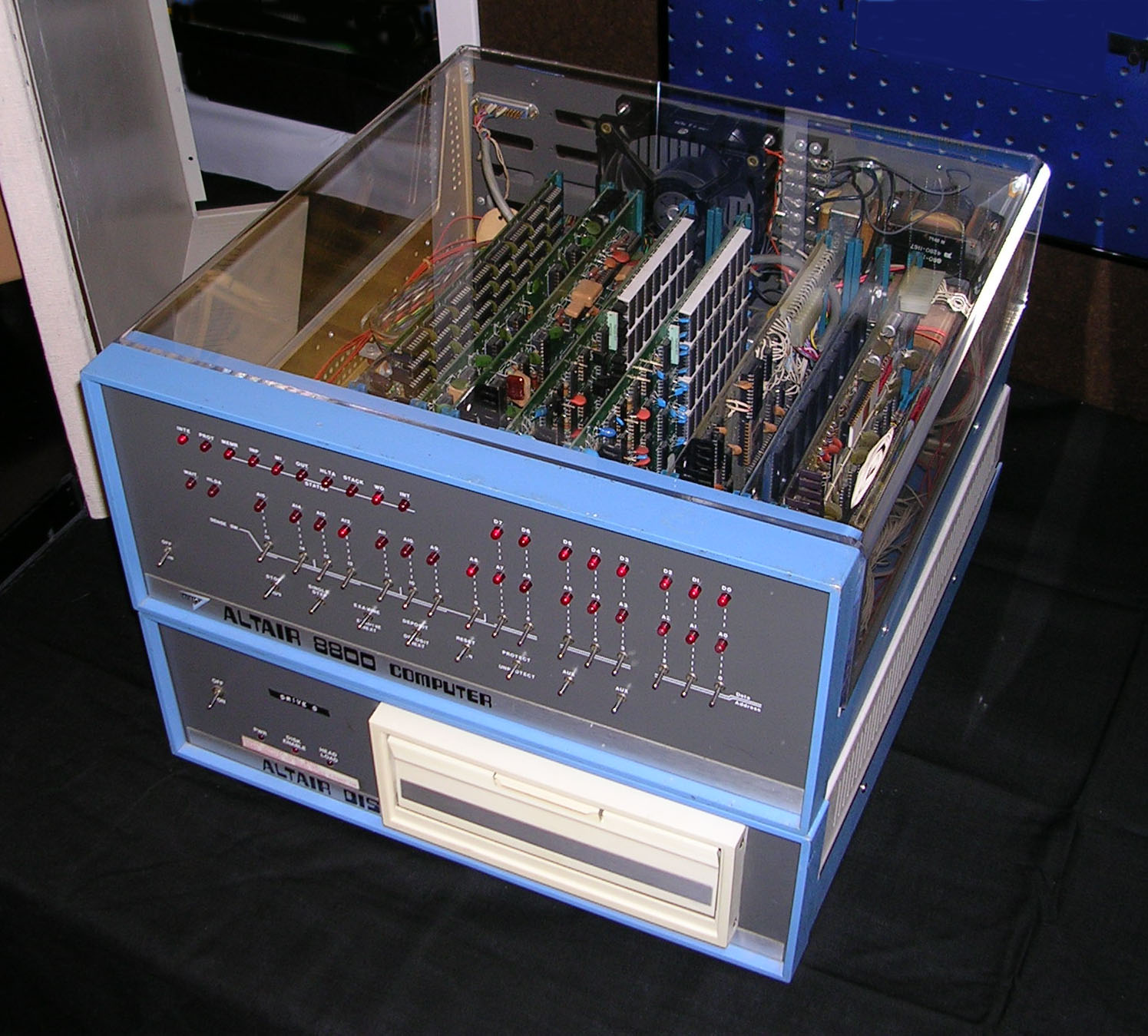
The Altair 8800 of 1975 would be hard to distinguish from what we would consider a computer in modern times. It was simply a metal box, not much larger than the case of a typewriter, but it had toggle switches all over it. No screen. No keyboard. No mouse. To run a program, you flipped those switches in sequence, one by one, feeding binary instructions directly into the machine by hand. The process was slow, physical, and strangely beautiful. Computing had a body then — you could see exactly what it was doing.
That visibility is mostly gone now. Modern computers are closed systems—flats of glass and aluminum that reveal nothing about what goes on behind the casing. The classic age, around the 1970s to early 1990s, was an entirely different story in terms of the relationship between man and machine. Beige cases, visible expansion slots, mechanical keyboards, glowing screens, and drives that made a noise when they started. These machines made computing legible. And that legibility, it turns out, was never just functional. It was a design philosophy.
The Altair 8800: Where the Front Panel Served as the Interface
The Altair 8800 is the computer by MITS that brought about the age of personal computers. The Computer History Museum states that the price of the computer kit was $395 and the fully built computer cost $498. MITS expected modest demand. Within three months, the backlog had reached approximately 4,000 orders — far beyond anything the company had prepared for.
What made the Altair visually remarkable was its front panel. Rows of toggle switches ran across the bottom. LED indicators sat above them in distinct groups. This was not decoration. The switches were the interface. You programmed the machine by setting each switch position in order, translating a program into physical binary state changes. The front panel was simultaneously the input, the output, and the visible proof that computing was happening at all.

1975 — MITS Altair 8800 with 8-inch floppy disk system — Wikimedia Commons (photographer: Swtpc6800, public domain) — reproduced for commentary and analysis.
We find the Altair's front panel more interesting to look at than almost any modern computing hardware. There is a directness to it — every switch is a decision, every LED a state. Modern interface design has spent fifty years hiding exactly that relationship. The result is convenience, certainly, but also a kind of opacity the Altair never had. For anyone facing this device, there could be no mistaking the amount of labor involved in computing. We have exchanged one quality for another, but it is reasonable to wonder if we made the right choice.
The aesthetics of the Altair very clearly belong to the discussion opened by retro-futurism, with the belief that the future of technology involved buttons, switches, flashing lights, and an open book of mechanics.
1977: Three Machines, One Year That Changed Everything
But in 1977, there arrived the "Trinity" of home computers: the Apple II, the Commodore PET 2001, and the Tandy TRS-80 Model I. All three devices had their own vision of what a personal computer should look like, leaving an imprint of hardware that was quite different.
The Apple II, created by Steve Wozniak and introduced in June 1977 at a price of $1,298, looked like a plastic case in beige color with a built-in keyboard and a slot for a monitor. Its eight expansion slots — running along the inside of the motherboard — were a deliberate design argument. The machine wanted to be opened. Third-party cards could extend its memory, connect it to networks, add graphics, or drive specialized hardware. The Computer History Museum describes it as a machine built with extraordinary emphasis on usability and expandability for ordinary people.

1977 — Apple II in typical configuration with 9-inch monochrome monitor, game paddles, and cassette deck — Wikimedia Commons (public domain) — reproduced for commentary and analysis.
There is something to say about the Apple II color that isn’t often talked about, and that is the fact that it was not neutral. Instead, it was an effort by Apple to make the computer appear to be more like furniture than any other kind of device. The case and shape made it seem like an item meant to be found at home rather than in a lab. The Apple II looked like it was meant to stay, and that confidence in the idea of permanent presence in a home was, at the time, genuinely radical.
The TRS-80 Model I, sold through Radio Shack's nationwide retail chain, brought something the Apple II did not: access. A person shopping for batteries could now also buy a computer from a familiar storefront. That retail presence changed what vintage computing looked like culturally. The machine itself — keyboard integrated with the main unit, a separate monitor, a separate cassette drive — was less cohesive than Apple's offering. The TRS-80 was forthright about what it was: a kit that served curious users who did not have an idea of the uses of the same.
The Commodore 64: Color, Sound, and the Blue Screen
Released in January 1982, the Commodore 64 holds the title for the most successful single personal computer model according to Guinness World Records. The total sales of the product span between 12.5 million and 17 million units.
The C64's visual identity was shaped by two things: the warm brown "breadbox" casing and the distinctive blue BASIC startup screen. Boot the machine and you saw white text on a deep blue field — a color combination so synonymous with the C64 that collectors immediately recognize it. The keyboard sat flush with the main unit, a chiclet-style layout in the same beige-brown plastic that read, in 1982, as solid and reliable.
Inside, the machine carried a dedicated SID sound chip and VIC-II graphics hardware that enabled sprites, hardware scrolling, and sixteen colors — capabilities that directly shaped an entire generation of game design. Developers worked directly with these chips, writing code that addressed specific hardware registers. The machine's limitations were public knowledge, not hidden behind abstraction layers. That openness produced extraordinary creative results.

1982 — Commodore 64, 8-bit home computer — Wikimedia Commons (photographer: Bill Bertram, CC BY-SA 2.5) — reproduced for commentary and analysis.
The Commodore 64's brown color is something the vintage computing community has long defended and modern audiences find strange. Brown plastic, in the context of 1982 home electronics, was not considered ugly — it was considered durable and serious. As much as the wood-grain paneling on wagons had its place and time in history, so did the earth-tone look on the C64. By the end of the decade, however, that color combination seemed outdated, as evidenced by the 64C update which favored white hues. However, the original “bread box” looks more genuine, in the sense that it looks more durable than flashy. The design had integrity that the revision lost.
This era of tactile, physical machine design connects directly to what cassette futurism later identified as a cultural aesthetic — the idea that the future was always made of buttons, slots, brown plastic, and visible mechanical logic. The C64 wasn't just a computer. It was the defining object of that entire visual vocabulary.
IBM PC 5150: When the Beige Box Became Business
The IBM Personal Computer Model 5150 was launched on August 12, 1981, at the price tag of $1,565. The 5150 model had an Intel 8088 microprocessor with a frequency of 4.77 MHz and MS-DOS as its operating system. From the perspective of physical appearance, the 5150 model has set the standard for many people’s mental image of a computer: the bulky and horizontally shaped beige unit on the table, with a keyboard and a monitor above that – usually the IBM green monochrome model 5151.
Everything about the design communicated seriousness. The proportions were deliberate. The grey-green screen had weight. The keyboard had heavy key travel. The IBM logo anchored the front panel. This was not a machine trying to be friendly. It was a machine trying to be trusted, and it succeeded. The Computer History Museum notes that IBM-compatible computers eventually became dominant in the personal computing market, precisely because the platform was open enough to be replicated and built upon.

1981 — IBM PC 5150 with keyboard and green monochrome monitor (5151) running MS-DOS — Wikimedia Commons (CC BY-SA 1.0) — reproduced for commentary and analysis.
The IBM 5150 has a complicated design legacy. It was not beautiful and never tried to be. But it was legible — a machine that communicated its own seriousness through sheer physical presence. Contemporary computing runs in the opposite direction, toward disappearance into a sleeve or a pocket. Whether vanishing is progress or loss depends entirely on what you thought the computer's relationship to its user was supposed to be. The 5150 made no secret of what it was. That honesty, in retrospect, looks almost radical.
The 5150's institutional gravity belongs to the same cultural moment as retro control rooms — those banks of dials, switches, and CRT monitors that once populated NASA mission control, nuclear facilities, and broadcast stations. The aesthetic of visible, accountable technology. A room or a desk that told you exactly what was happening because it couldn't afford to.
The Macintosh 128K: A Different Object Entirely
The Macintosh 128K version was introduced by Apple on January 24, 1984, and retailed for $2,495. The computer’s CPU was the Motorola 68000; its RAM was 128KB, while its hard drive was 400KB 3.5-inch floppy drive and had a screen that was 9 inches black and white. What the machine carried instead was a completely different conception of how a person should relate to a computer.
The Macintosh's form was vertical, compact, and deliberately unified. The screen and system unit were a single object. The mouse — a small white rectangle with one button — connected by a cable. The interface used windows, icons, menus, and a pointer. You moved things around on screen rather than typing commands at a prompt. That idea, drawn partly from Xerox's earlier Alto research, was finally packaged into something a person could pick up and carry, because a handle was molded directly into the top of the unit.
MacWrite and MacPaint shipped with the machine, both designed around the graphical interface. You couldn't use those applications through a command line. The software and the hardware were arguments for the same thing.

1984 — Original Macintosh 128K — Wikimedia Commons (photographer: Sailko, CC BY 3.0) — reproduced for commentary and analysis.
The Macintosh's design is often described as "friendly," but we'd call it something more pointed: confident. The machine arrived knowing exactly what it was for and who it wanted to reach. That confidence was also, frankly, a kind of arrogance — the Macintosh launched at $2,495 in 1984, which priced out the very audience Apple claimed it was liberating. A schoolteacher or a first-time home user couldn't afford it. The machine preached accessibility while practicing exclusivity, and Apple knew it. The original vision of computing for everyone had to wait for prices to fall before it was anything more than a sales pitch with excellent typography.
The visual grammar of the Macintosh — that curved, compact verticality — shares something with the broader space age modernism that shaped product design from the late 1950s onward. The idea that plastic, when handled with confidence, could look like the future. The Mac proved it still could in 1984.
What Physical Design Actually Said About an Era?
The visual language of vintage computers was not incidental. Every casing choice, keyboard layout, and screen color reflected a set of assumptions about who was using the machine, where it would sit, and what computing was supposed to accomplish.
The toggle switches of the Altair addressed a self-selected technical audience, people willing to learn binary by hand. The open expansion architecture of the Apple II addressed experimenters who wanted a platform, not just a product. The retail accessibility of the TRS-80 addressed people who had never considered buying a computer until they saw one at Radio Shack. The IBM's grey formality addressed offices that needed managerial approval before a computer could appear on a desk. The Macintosh's compact self-containment addressed anyone who felt excluded by every machine that came before it.
The materials reflected the same distinctions. Warm beige plastic read as domestic. Darker, heavier chassis read as professional. Transparent cases or bright colors — more common by the late 1990s with machines like the Apple iMac G3 — read as playful, personal, expressive. These were not arbitrary choices. They were arguments about what computing meant and who belonged in the room.
Collectors hunting vintage systems today often describe this in terms that sound almost like art criticism: the visibility of the hardware, the ability to open a case and understand what each part does. As collector Jason Moore, who has assembled machines from Atari, Commodore, Apple, and Radio Shack across 25 years, described it — you can open an older machine, point to each component, and explain exactly how the system works together. That clarity no longer exists in modern hardware, where integration has absorbed function into single-chip architectures that reveal nothing.
This is where vintage computing intersects naturally with the analogue futurism aesthetic — the cultural argument that the future was always supposed to have more buttons, not fewer. More dials. More visible logic. The vintage computer was the most powerful version of that argument, because it was real.
The Sound and Texture That Has Since Disappeared
Vintage computing was not only a visual experience. Floppy drives produced a mechanical chatter on read and write cycles. CRT monitors emitted a low-frequency electronic hum. Mechanical keyboards clicked with physical feedback that modern keyboards largely suppress. Dial-up modem handshakes — that specific sequence of tones and analog negotiation across telephone lines — became one of the most culturally recognized sounds of the late twentieth century.
These sounds were not noise to be engineered out. They were information. A user could hear when a disk was being read, when a program was loading, when something had gone wrong. Modern computing treats sound as decorative. Vintage machines treated it as part of the feedback loop.
The same applies to the visual texture of CRT displays. Text on a monochrome phosphor screen had a glow and a slight physical depth that LCD panels don't replicate. Early color graphics produced roughly sixteen distinct colors with a saturation and contrast that felt aggressive — vivid without being fine, loud without being precise. That aesthetic cannot be reproduced by running old software on modern displays. The hardware itself was part of the look, and the look was inseparable from the era that produced it. This connection between hardware and visual culture is something the OMNI Magazine era understood instinctively, pairing cutting-edge computing imagery with the very screens and machines that readers had at home.
Why the Machines Still Matter?
The modern smartwatch has greater computational capabilities than personal computers from the 1980s. Such a statement is accurate in a technical sense but meaningless in terms of history. The significance of vintage computers was never measured in processor speed.
What these machines accomplished was a shift in who computing was for. They moved it from institutional control into individual ownership. Programming became something that one could do from their own home using a device that would react instantly to your commands. BASIC is the best example of this – you would simply give a command and press enter, and you'd have a result. You did not need any accounts, downloads, or installations. It was ready as soon as you turned it on.
That invitation created the engineers, developers, writers, and designers who would create an industry to follow. A young user teaching himself BASIC on a family's C64 who later worked for Microsoft — that story, documented in the Smithsonian's collection — is not an anomaly. It was the point. The machines were gateways, not just products.
Preservation efforts at institutions like the Smithsonian National Museum of American History and the Computer History Museum keep working examples available precisely because software emulation cannot fully replace the experience of using them. The weight of the keyboard, the sound of the drive, the specific phosphor glow of a CRT — these are properties of original objects. They carry information that specifications alone cannot transmit. The physical culture of computing deserves the same attention we give to the visual aesthetics of any other designed era.
The Object That Argued for Itself
We keep returning to the same observation about vintage computers: they were honest objects. The Altair 8800 told you, through its front panel switches, exactly how much effort computing required. The Commodore 64 told you, through its exposed SID chip and open architecture, exactly what its hardware could do. The Macintosh told you, through its compact vertical form and integrated screen, exactly what kind of computing Apple believed in. Each machine was a position, not just a product.
Modern computing devices make no such declarations. They are deliberately neutral, sealed, and designed to disappear into whatever function they are asked to serve. That adaptability has obvious value. But something was lost when the object stopped arguing for itself. Vintage computers were opinionated in a way that current hardware almost never is — and that quality, the willingness of a physical object to take a position, is worth studying, preserving, and looking at directly. We believe the era that produced the beige breadbox and the green phosphor screen understood something about design that the aluminum-and-glass era quietly abandoned: that the machine itself is a statement, and statements should be legible.



.jpg)