What comes of a society that believes the future should look handcrafted and not smooth, not minimalistic, not encased in glass? Riveted, polished, layered and loud with obvious intent. This is the question that steampunk has been attempting to answer in some form or another before there was even a name for it.
The style is defined by the fashion of goggles, top hats, leather corsets, and clockwork jewelry. These are all true, but they are only the surface. The deeper meaning of steampunk is a visual argument about machines. Namely, it argues that a machine should have a form. Its internal mechanics must be visible. Rather than hidden within a seamless case, complexity must be out in the open and in motion.
That argument is more difficult to refute than one might initially believe, which may be part of the reason for its continued production of compelling visuals even now.
The Industrial Era Machines That Started It All
The visual logic of steampunk did not begin with fiction writers. It began with the actual machines of the Industrial Revolution. A working steam engine from the early 19th century was not designed to be beautiful. But it was, unavoidably, legible. Pistons moved. Valves opened. Pressure gauges gave readings you could see across a room. Every stage of the process occupied physical space and announced itself.

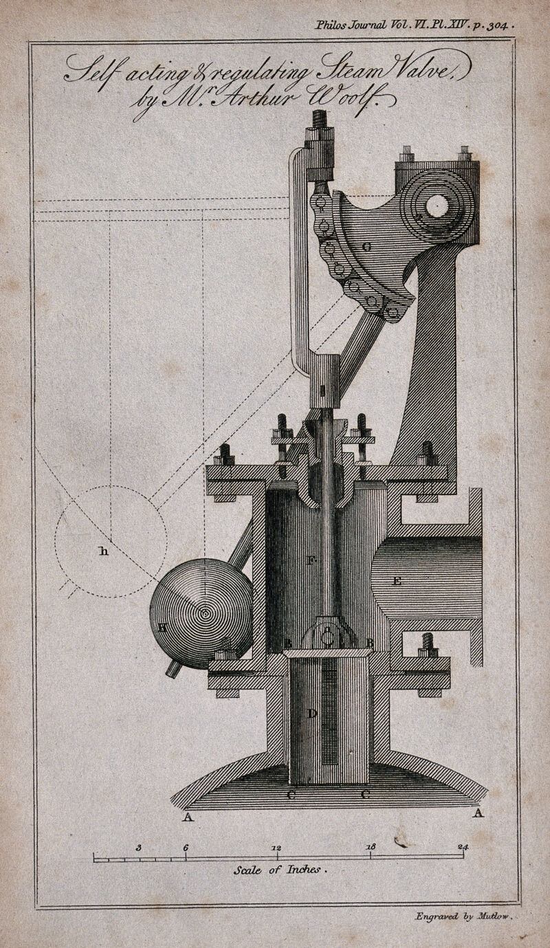
A steam valve for an engine. Engraving by Mutlow, undated. Wellcome Collection, Public Domain. Reproduced for commentary and analysis.
We look at this engraving and find something that modern product design has spent decades trying to eliminate: the honest display of how something works. Every valve, joint, and pressure point sits on the surface for inspection. As steampunk is at its best, it is a refusal to accept that machines couldn’t have looked like this. Whether this is a reaction or just romanticism might depend on how much confidence one places in minimalism as progress.
By the Victorian era, engineers had already discovered the visual tension that would later define steampunk: industrial function increasingly collided with ornamental ambition. The Science Museum has documented machines from this period whose cast-iron frames incorporated Gothic tracery. A model of the 1832 paddle ship Dee, for example, built architectural detailing directly into its engine framing. This was not decoration applied after the fact; the ornamentation was part of the engineering intention itself.
That fusion is the historical seed from which steampunk's aesthetic logic grows. The genre does not invent the combination of beauty and mechanism. In that sense, it magnifies what the 19th century was already doing, but wonders about the world that could have been created if that trend had not been broken in its course. On a visual level, steampunk goes very well with the language of analog machines in which the workings of the object mean as much as the object itself.

Engineering: a steam engine, and drying chambers. Wood engraving by E. Jewitt, 1856. Wellcome Collection, Public Domain. Reproduced for commentary and analysis.
The components are arranged by Jewitt with something akin to the architect’s eye. Here the engraving is similar to the depiction of a cathedral, in which the system of stonework can be understood visually. Steampunk illustration inherited this instinct almost completely. The genre itself is truly indebted to the technical engraving of the 19th century, a heritage that in our opinion has not received enough recognition apart from the common mentions of Verne and Wells.
Albert Robida and the Visual Language of a Future That Never Happened
In the group of illustrators that created the visual tradition which steampunk took from, Albert Robida occupies an especially well-documented position. A French illustrator, caricaturist, and novelist born in 1848, Robida spent much of the 1880s producing detailed illustrated visions of life in the mid-twentieth century. His trilogy of speculative novels, beginning with Le Vingtième Siècle in 1883, imagined Paris in the 1950s as a city still driven by visible, handmade-looking mechanical ingenuity.
Scholars and cultural historians have repeatedly drawn a line from Robida's compositional approach to steampunk's visual conventions, and that line is easy to see. His illustrations depict airships shaped like enormous fish crowding the towers of Notre-Dame. Aerocab stations bolted to the top of the Tour Saint-Jacques. A night sky above Paris so thick with personal flying machines it reads like a lantern festival. His line work is dense but precise, full of rivets and struts and gondola windows, combining Victorian architectural ornament with pure speculative engineering. This documented visual territory connects directly to what we have written about separately in our retro-futurism journal, where the relationship between historical design and imagined futures runs through multiple movements.

"La Sortie de l'Opéra en l'an 2000" (Leaving the Opera in the Year 2000), c. 1902. Hand-colored lithograph by Albert Robida (1848–1926). Library of Congress Prints and Photographs Division, LC-DIG-ppmsca-13553. Reproduced for commentary and analysis.
The sky over the Opera in Robida's future world is lively and almost cheerful, with machines that resemble Victorian parasols rather than sinister flying machines. Steampunk did not take anything else from Robida but his compositional logic of making technology decorative, making function into spectacle, making a machine an object to be admired. Robida was depicting a future built manually, not industrially and enclosed. This particular quality became one of the visual trademarks of steampunk, even though other artists discovered it via completely different paths.
Robida's machines are not background objects. They are compositional protagonists. The airship does not merely transport passengers; it dominates the frame, its details elaborated to the point of personality. This treatment of technology as visual subject, rather than setting, is foundational to steampunk's approach across every medium it has occupied.

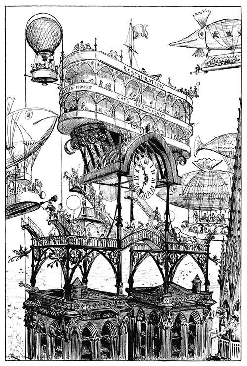
"Station centrale des aéronefs à Notre-Dame" (Central Aircraft Station at Notre-Dame), from Le Vingtième Siècle by Albert Robida. Paris: Georges Decaux, 1883. Wood engraving. Via Old Book Illustrations / Getty Research Institute / Internet Archive. Reproduced for commentary and analysis.
Place this image next to a panel from any contemporary steampunk graphic novel and the visual kinship is immediate. Notre-Dame does not look smaller or overwhelmed by the technology. The gantries and docking structures arrive as an additional layer of ornament, sitting on the Gothic stone with peculiar comfort. That visual philosophy, of fantastic technology as a continuation of existing craft rather than its replacement, is arguably the most intellectually honest formulation of what steampunk is actually proposing.
The Material Palette: What Steampunk Actually Looks Like
Brass is the first thing. Not gold, not chrome. The material that does this job the best is brass, because of its warm tonal colors, its potential for forming a patina as well as its long tradition of use in instrument making, clockwork, scientific devices, and marine hardware. When steampunk art wants to evoke old age and precision, it uses brass.
Copper accompanies it; its color is somewhat cooler, linked to electrical appliances and piping. Iron provides structural weight. Dark wood softens the industrial register. Leather introduces human scale. Together, the two types of materials create a combination that is equally both warm and technical, equally both historical and futuristic. Material thinking also defines the imagery of industrial design interfaces with analog dials, riveted panels, and exposed wires conveying information not through their functionality but through their materiality.
Surface treatment is also as important as material. Steampunk artifacts tend to look imperfect. Patina, scratches, rivets, visible joints, and exposed fixtures all indicate that the artifact has been fabricated, restored, modified, and used. Such a vocabulary of material is very different from the hermetic surfaces of modern electronics. A steampunk device looks as though a person built it. You can tell where the decision was made.

"Départ d'un ballon transatlantique" (Departure of a Transatlantic Balloon), from Le Vingtième Siècle by Albert Robida. Paris: Georges Decaux, 1883. Photogravure. Via Old Book Illustrations / Getty Research Institute / Internet Archive. Reproduced for commentary and analysis.
Robida's transatlantic airship includes all the details of an elegant Victorian house – portholes, railings, and people waving from the deck – as well as no hint of any kind of transport in the modern sense. It reads as an event, a structure, a piece of public architecture that happens to float. But steampunk’s continuing preoccupation with airships harks back to this very notion of mobility as something beautiful, deliberate, and grand, as opposed to efficient, invisible, and minuscule. Whether such a bargain is worthwhile depends on what one takes transportation to be truly about.
The Gear as Metaphor
There is no other artifact which has become more emblematic of steampunk than the gear. Historically, gears have been an integral part of clocks, watches, mills, and industrial machinery. Precise, interlocking, and always visible, unlike circuit boards. Steampunk has taken gears and made them bigger.
Decorative gears are hung on walls and in pieces of furniture, worn as jewelry or on clothes. Small gears are visible inside watch-like gadgets. Entire architectural schemes are built around gear motifs. This is an important distinction from actual mechanical engineering: Victorian engineers generally concealed components where safety or reliability required it. Steampunk exposes everything deliberately. The gear is not just a piece of technology but also a symbol, an image arguing that technology needs to be visible, that one can look at a machine and see what it does.
The argument takes on special significance in the present moment. In modern-day technology, a processor completes billions of functions in the blink of an eye in a package smaller than your thumb, and all the user sees is a flat glass screen. What did we give up when we decided to sacrifice that visibility? There is no simple answer to the question, but the imagery persists, and that may be why it continues to resonate. The same conflict plays out in retro electronics, where the internal workings of machines are visible in a way modern machines deliberately obscure.
The Arts et Métiers Station: Steampunk Built at Full Scale
The actual sites where the visual logic of steampunk is implemented on an architectural level include the platforms of the Arts et Métiers Metro station in Paris, which rank among the best-executed implementations of steampunk. They were created in 1994 by the Belgian artist and comics illustrator François Schuiten, who was assisted by Benoît Peeters, on the occasion of the 200th anniversary of the Conservatoire National des Arts et Métiers.
Schuiten lined the tunnel in copper. Giant cogs hang from the ceiling. Porthole windows open onto small fantastical scenes. The lighting is soft and warm. The impact is immediate: you are in a submarine, specifically that of the type which would have been commissioned by Captain Nemo from Jules Verne, and where the engineering is stunning as it was meant to be admired. RATP documentation and Schuiten's own published commentary on the project confirm the copper treatment, the Nautilus reference, and the intention to make the technology visible and inhabitable rather than institutional.

Platform, Line 11, Arts et Métiers Metro Station, Paris. Design by François Schuiten and Benoît Peeters, 1994. Photograph. Wikimedia Commons. Reproduced for commentary and analysis.
Copper does something to underground light that tile cannot. It brings warmth to the tunnel and gives it weight, making it more human than institutional. The decision by Schuiten to limit the surface treatment to copper and brass – as revealed by his own description of the project – is the discipline that holds the design together. We have walked through this station and the consistency of the visual logic lands before you consciously register why. That is what fully committed environmental design actually feels like. Most themed spaces announce their intentions too loudly. This one lets the material speak.
The station is also a useful test case for something steampunk visual culture often avoids: the difference between reference and pastiche. Schuiten did not reproduce a Victorian interior. Using Victorian elements in his material, proportioning and motifs, he was able to achieve something that is historical in origin, but completely modern in its conception. The visual aspect of steampunk depends entirely on this.
Typography in Steampunk and Page as an Object
The typography conventions found in steampunk are based on one particular period in history, namely Victorian commercial printing at its most extravagant. Large serif fonts, ornate capitals, letterpress effects, the color of aged paper, and even borders derived from engravings are used extensively in steampunk-inspired design.
The lettering is rarely clean. Ink shows pressure variation. Edges sit slightly rough, the way wood type prints when ink builds at the stroke edges. Color palettes run to sepia, ivory, dark brown, with occasional accents of deep red or teal, restrained compared to flat digital design, but expressive within their range.
Robida's own book design is instructive. His covers and interior illustrations treat type and image as parts of the same composition. Text flows around drawings. Chapter headings use ornamental frames. The page reads as a unified visual object rather than a grid with content filled in. This integration of type, image, and surface is something that pulp science fiction magazines explored from a different angle in the 20th century, where layout and material choices carried as much meaning as the fiction inside.
The Japanese Steampunk Line
Steampunk's visual development did not run in a straight line from London to contemporary illustration. A notable counterpart to steampunk emerged in the world of Japanese manga and animation, dating as far back as the 1940s with science fiction by Osamu Tezuka, and increasing in importance since the 1980s with the work of Hayao Miyazaki in his films.
Hayao Miyazaki's film The Castle in the Sky (1986), made by Studio Ghibli, is often discussed in writing about steampunk animation as an example of steampunk aesthetics being defined for the Japanese public. Flying machines, ancient robots, and a falling-down fortress island in Miyazaki's film use the same visual grammar as Robida's illustration – visible mechanics, a hand-built look, technology that was put together carefully because it was beautiful.
This is where the contribution of the Japanese tradition of animation came into the picture. While Western steampunk is mostly concerned with huge creations, the work done by Miyazaki is equally concerned with the minute details on the human-scale level, like the wear and tear of a jacket or a mechanism failure of any particular tool. That shift in register changed what steampunk could communicate emotionally. The visual tradition around these imagined machines connects naturally to the broader mid-century space art tradition, where illustrators similarly grappled with making speculative technology feel physically inhabited rather than conceptually abstract.

Industrial machinery interior, brass and copper fittings, circa early 20th century. Raufoss Industrier, Norway. Photographer unknown. Raufoss Industri Park. Wikimedia Commons, Public Domain. Reproduced for commentary and analysis.
This is what steampunk is actually drawing from, not the fantasy of Victorian engineering but the documented physical reality of it. Brass pipe runs, pressure gauges, valve housings, and riveted structural frames are the genuine visual vocabulary, and they are more compelling than most of what the genre produces when it layers ornament on top of them. Steampunk's visual problem, and we think it is a real one, is that the historical source material is frequently more interesting than the genre's own interpretations of it.
The Line Between Conviction and Costume
Every visual subculture eventually faces the question of dilution. In this article's framing, there is a meaningful distinction between steampunk visual work that carries structural conviction and decorative appropriation that retains the surface markings (gears, brass tones, serif typography) without the underlying logic. A pair of goggles with clockwork glued to the frame is not steampunk in any intellectually meaningful sense. It is costuming.
The distinction, as this article draws it, comes down to whether the visual choices are motivated. Does the gear serve a compositional purpose? Does the material choice communicate something about the object's imagined function? Does the typography integrate with the image, or is it applied afterwards?
Robida's illustrations hold up under that scrutiny because every visual decision in them is motivated. The fish-shaped airships are not arbitrarily whimsical; they represent Robida's argument that future technology will develop its own organic forms, just as the technology of his era had. The crowded skies are not decorative congestion; they are a specific visual claim about what urban density looks like when the vertical dimension becomes inhabitable. The logic connects all the way down. This visual discipline is something steampunk shares with cyberpunk's visual identity, which similarly separates compelling work from surface pastiche based on whether the visual choices are earned or merely assembled.

"Le journal téléphonoscopique" (The Telephonoscopic News), from Le Vingtième Siècle by Albert Robida. Paris: Georges Decaux, 1883. Wood engraving. Via Old Book Illustrations / Getty Research Institute / Internet Archive. Reproduced for commentary and analysis.
This image has been widely compared to television, with commentators noting how closely Robida's wall-mounted screen anticipates broadcast media. That comparison is worth making, but it is a later interpretation, not something established by the historical record itself. What actually holds our attention is the compositional decision: Robida draws the screen as furniture, integrated into a domestic space alongside wallpaper and chairs and fully clothed family members. The technology belongs to the room. Steampunk at its best maintains exactly this integration. When it fails, the machine hovers above the world as a concept rather than sitting inside it as an object.
What Steampunk Visual Culture Is Actually Arguing?
Strip away the conventions and look at what the visual argument actually claims: that technology developed a rich, readable, human-scaled aesthetic vocabulary during the Industrial Revolution, and that vocabulary was traded away for reasons that had more to do with manufacturing efficiency than with any considered visual philosophy.
That claim is disputable. Modern technology does things that steam engines cannot, and the visual minimalism of contemporary design serves real purposes. But the visual argument is separate from the functional one. A smartphone may be more capable than the Nautilus, but the Nautilus looks like something. Its mechanisms suggest a mind behind them, an inventor with preferences and particular ideas about how a hatch should be sealed or a gauge should be mounted. Steampunk visual culture asks whether something was genuinely lost when we traded that legibility for capability.
The question continues to create fascinating visuals and this may be the reason for the genre’s enduring presence for the past few decades. If steampunk's staying power remains to be determined by the facts; one thing that is clear from the visual evidence thus far is that it is based on actual history, not merely nostalgia. The Raygun Gothic tradition made a comparable move, building a future-facing visual style on the industrial optimism of mid-century America, and that lineage has proved equally durable.
This image shows Robida's vision of future healthcare: a floating medical facility, suspended from a balloon, positioned above mountain air. It is not entirely absurd. The underlying premise, that environment and space matter to recovery, is one that contemporary medicine has spent decades confirming. We are not arguing for airship sanatoriums. What we notice is that Robida's speculative technology always seems motivated by a genuine question about how life could be organized differently. That motivation is what separates his work from decorative futurism, and it is what the best steampunk visual practice continues to reach for.
Collecting the Source Material
Historical steampunk visual material lives primarily in 19th-century illustrated books and scientific periodicals. Robida's work is held in collections at the Library of Congress, the New York Public Library, and the Bibliothèque nationale de France, with large portions digitized through Gallica and the Internet Archive. The original volumes, as physical objects, carry qualities that digital reproduction cannot fully convey: the weight of the paper, the depth of the engraving impression, the integration of type and image across the page.
For readers drawn to adjacent historical visual movements, Still Edition's journal covers related territory across several issues, including the art direction of OMNI Magazine, which brought a similarly ambitious approach to visualizing speculative futures through editorial design in the late 20th century. The full print collection is available at stilledition.com/collections/all.
A Final Observation
What stays with us, after extended time with steampunk's visual history, is not the spectacle. The airships and the clockwork are the genre's most familiar faces. What actually holds attention is the smaller register: the porthole in the Arts et Métiers platform that opens onto a miniature scene of an imagined machine. The engraved steam valve that looks almost like a drawing of a flower. The specific way Robida renders the gondola of an airship so that you can see the weight of the glass in the windows.
Those details suggest that the people who built this visual language, both the historical illustrators and the contemporary practitioners, were not primarily chasing spectacle. They were after the quality of attention that a well-made thing demands. The mechanism is worth looking at. The process of making is worth showing. In a visual culture that has largely accepted invisibility as the price of capability, steampunk insists otherwise, and we find that insistence worth taking seriously, even when we remain skeptical of everything else the genre brings along with it.